Genesis of a Module/Cover: I’m the Bad Guy?!
I had the idea to create an adventure starring monsters in 2015 and by early 2016 I started typing up notes. At the time I used Word for all my projects. This is what it looked like.

Of course, there are many adventures and modules out there allowing you to play as the monsters. This one I wanted to be a little different. It wasn’t just creating monsters and running them in the same adventures that humans and demi-humans partook in.
No: in “I’m the Bad Guy?” I wanted to have a monster oriented story. I wanted the monsters to be able to crush puny humans. Around this time I met Luka Rejec and as we discussed future projects I mentioned this idea. He instantly said, “That should probably be a board game.” The annoying thing is that I think he was probably right, but I forged ahead. Well, trudged slowly ahead. Now I was beginning to define monster powers and abilities.

Life happened and I worked on other things, including some unpublished novels, as well as Invasion of the Tuber Dudes and Worm Witch: The Life and Death of Belinda Blood. I started to realize I’d need to create a unique system to best use this idea. Around this time I begin to learn how use Indesign. This meant a big step back in available time but much better tools at my disposal. Around this time I moved to Thailand and, living in a small town, had quite a lot of creative time available

Setting
There are so many different kinds of monsters I chose a forest as the primary setting. Forests are, after all, a kind of short hand for unbridled, pure nature in a way that a desert or even a mountain isn’t. This means that some creatures are more similar than different (Leshy and Dryad, for instance) but also provided a unifying theme that helped the story. I did cheat and include monsters like Medusa just because she’s cool and the monster I’d probably most like to play. My thought was that if this module proved popular, it would be cool to have other editions: desert, ocean, swamp, etc. The place names mostly come from anime.
Art
At some point I started trolling deviant art for inspirational images. There was so much great stuff but it has hard to reach the artists about licensing. This was before I choose to do the art in black and white. I had a lot of images like the below one as “place holders.”

After a long road trip and before a trip to South America, I swore that by Halloween 2019 I would be done. By now I had dropped Indesign in favor of Affinity Publisher so had to start again. Now I added branches and trees and began over-designed each page. To be fair, I kept a lot of that in the final product, despite knowing it didn’t add much value. Halloween 2019 came and although I had 30 pages more or less finished, it wasn’t ready.

It was starting to get close to the final shape. In 2020, I moved back to Korea and once spring came, I decided this year was the year. I commissioned art from two great artists (LF OSR and Justindrawscomics) and once I had a financial investment to match my 200+ hours, it was time to buckle down. I was working full time and most of the free time I spent working on Meatlandia Book III, but when I could I worked on this bit by bit. For a few months, I stayed up until 4 or 5 am collecting public domain art and handwriting notes of elements to include. Finally, come October it was done.

The Cover
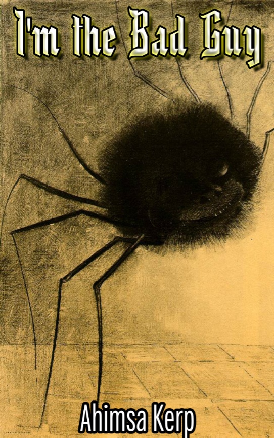
I’m a writer, not an artist. I’m pretty design blind though I have been working hard to get better. With early covers, I used Kittlesen art and pretty basic typography.

Fiddling around with covers has become one of my favorite forms of procrastination. I did a whole bunch with art from Beksiński, but of course his art is not in the public domain. So these, too, were placeholders while I kept working on not working on finishing the damn thing.

Using Public Domain art, I made a bunch more. By this time I had purchased Affinity Photo and begun using Canva as well. This cover is indictive of about a dozen different ones and, I think, fine but when Wind offered to do something weird and cool I would not and could not say no.

I like how the bright colors clash with the muted interior, and the Picasso nod is just weird and cool. The interrobang is the perfect description of wonder and shock that these monsters must feel when learning that they are considered “bad” by the invading humans.

That’s it
I’m super happy with how it turned out. The art is fantastic and the game is fun to play. Is it selling well? Well, no. At this rate it will take a couple years just to earn back the artists fees. (And both artists offered very reasonable rates.) But that’s kind icing on the cake. I’m glad I wrote it; I’m glad it exists, even if it probably should have been a board game. If you’ve played it or even enjoyed reading this, feel free to let me know!


